Post Cards To My Younger Self
Silver Anvil Award Finalist. Researched, designed, and delivered in 20 hours.
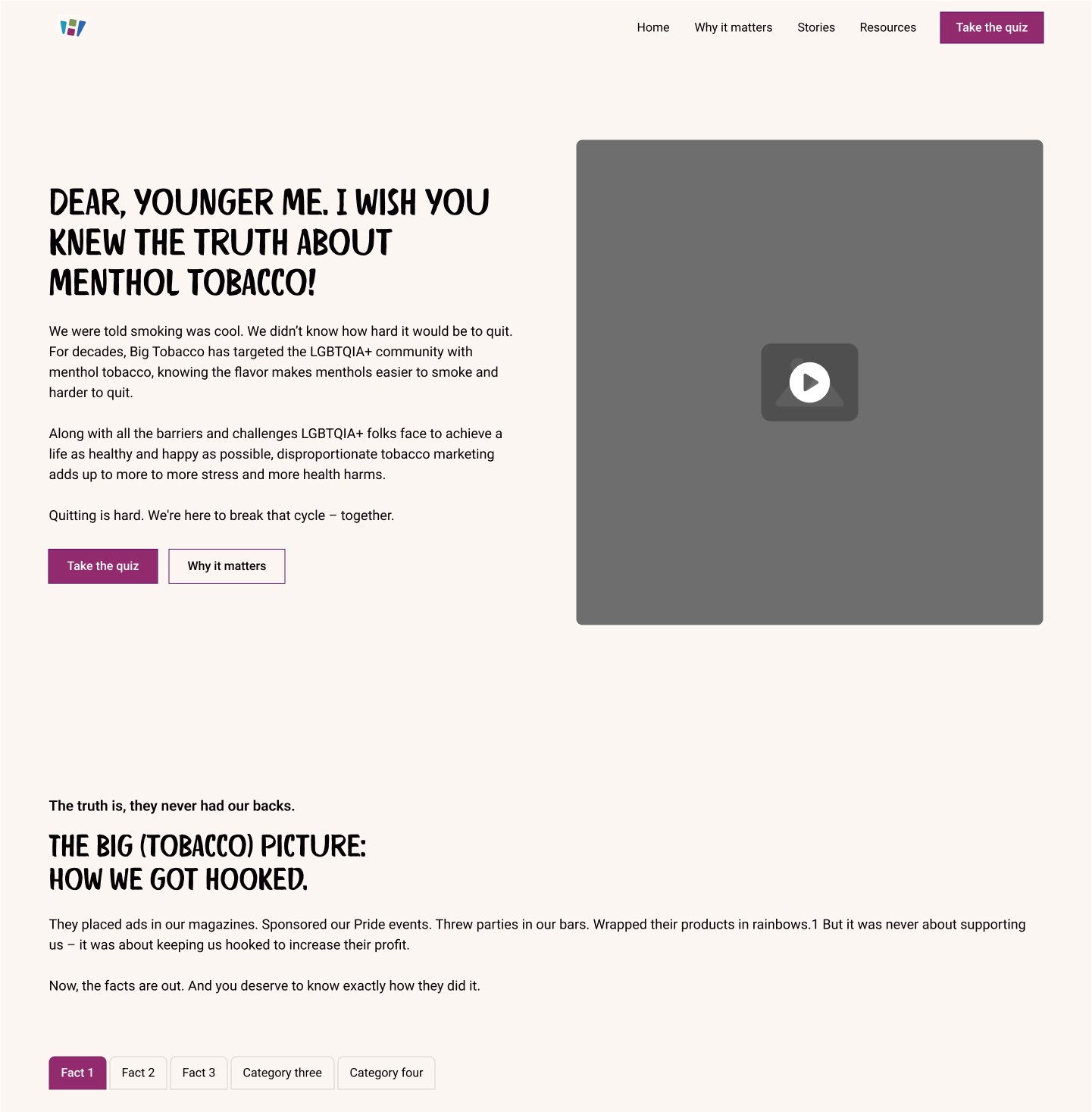
Postcards to My Younger Self is a Washington State Department of Health campaign addressing how the LGBTQIA+ community has been disproportionately targeted by menthol tobacco marketing for decades. My role was to design a single-page campaign site that didn't just inform users about the dangers of menthol, but actually made them feel seen. Instead of leading with fear, we led with intimacy, community voices, and a personalized quiz experience that met users exactly where they were. The campaign is now a Silver Anvil Award finalist.
Project Overview
The Challenge
The Washington State Department of Health needed a campaign site that could deliver resources, helplines, and authentic community stories for the LGBTQIA+ community, all within a very limited budget and timeline. My total hours for research, design, meetings, and QA/QC combined came to just 20.
But the timeline wasn't the only challenge:
- I was onboarded early but had limited access to the client, which meant less time to ask the right questions and get into the room where decisions were being made
- No personas had been defined, leaving the team without a clear picture of who we were actually designing for
- The target audience had heard every anti-smoking message before, meaning a traditional "here are the facts" approach was never going to land
- Midway through the project the scope shifted, moving from a simple pledge feature to a personalized quiz experience that needed to meaningfully categorize users based on their responses
The Process
Discovery
With limited client access and only 20 hours total, I couldn't afford to wait for direction that wasn't coming. When I asked the marketing team if we had personas and learned we didn't, I didn't stop. I built them myself and kept moving.
I created three mini personas to anchor every decision that followed:
- Ready to Take the Pledge: Already aware of nicotine targeting, potentially with a personal reason to quit
- Curious Explorer: A casual smoker who may not realize they are being targeted, open to learning more
- The Nervous One: Knows they should quit, has tried before, worried about social pressure and what quitting really means
Rather than presenting personas as a separate deliverable, I embedded them directly into my content hierarchy document so the team could see exactly how the outline relied on them. That's when the conversation shifted. After some pushback about time and budget, the team aligned, and personas became the north star for every decision after. They have since become standard practice on all projects.

Design
With personas defined, I built a content hierarchy around one core belief: this audience had heard every warning before. Facts alone were never going to land. The only way to connect with people who had been lectured at for decades was to make them feel seen first.
The four sections of the site reflected that philosophy:
- Awareness and Empowerment: Acknowledge the targeting before asking anything of the user
- Community Voices: Let the LGBTQIA+ community speak for itself through authentic storytelling
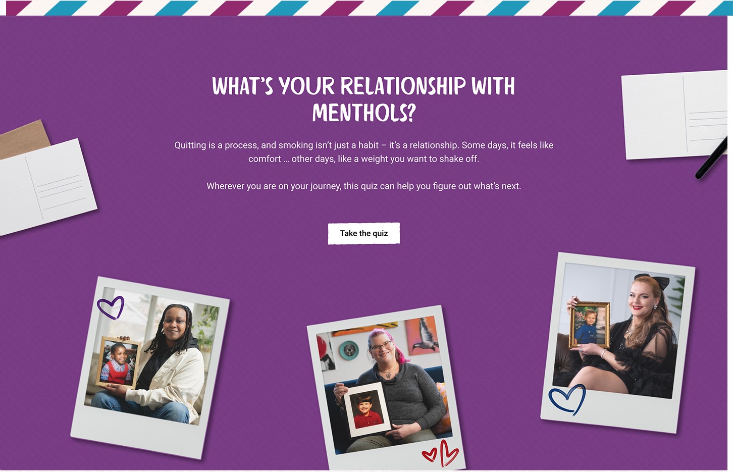
- Action and Engagement: The personalized quiz, meeting users exactly where they are
- Support and Solutions: Resources and helplines, earned by the trust built in the sections before
The quiz itself came from our marketing team, who pitched it as a more engaging alternative to a simple pledge feature. My contribution was the logic behind it. I created the three result categories users could land on, collaborated with a marketing team member and copywriter to build out the questions, and made sure the answer paths held up across every combination and edge case. If the logic didn't serve one of our three personas, it got reworked.
Delivery
With such limited hours, QA/QC had to be focused and fast. I reviewed the built site against the approved designs, flagged inconsistencies, and made sure the quiz logic worked correctly across all possible user paths before launch.

The Solution
The final design delivered a single-page campaign site that led with empathy before asking anything of the user. By structuring content around awareness, community voices, engagement, and support, the site created a natural journey that felt personal rather than preachy.
The personalized quiz gave users a way to reflect on their own relationship with menthol tobacco and arrive at resources tailored to where they actually were, not where the campaign assumed they should be. Three distinct results meant no one got a one-size-fits-all answer.
Built in Webflow using Relume components to stay within budget, the site balanced storytelling, interactivity, and accessibility without sacrificing any of the three.


The Outcome
The campaign launched successfully and resonated with the community it was built for. Members of the LGBTQIA+ community shared the site organically, praising it for holding space for their experience rather than delivering the same tired anti-smoking message.
The impact went beyond the launch:
- The campaign is a Silver Anvil Award finalist, the highest recognition in the PR industry
- The persona framework I fought for mid-project was adopted as standard practice by our creative studio team
- The Marketing Director on the project reached out to the broader team specifically to recognize the strategic thinking behind the persona development and its impact on the work