Use Food Well
Silver Anvil Award Winner.
Best of Show. PRSA 2024. Use Food Well is a Washington State Department of Ecology initiative helping residents reduce food waste through practical tools like shopping guides, composting tips, and leftover recipes. I redesigned the site to fix a high-bounce, low-engagement experience, restructuring content and repurposing existing components under tight budget and development constraints. The project went on to win two PRSA awards: Best of Show and the Silver Anvil.
Project Overview
The Challenge
The Use Food Well website was underperforming from launch. Users were averaging just 6 seconds on the English site and 2 seconds on the Spanish version, with sessions rarely extending past the homepage.
Two core problems stood out:
- Calls-to-action were unclear, leaving users with no obvious next step
- The most valuable content, practical tips on saving food and money, was hidden inside a video that most users never reached
To make things more challenging, I was brought in mid-project after the design budget had largely been spent. That meant:
- Designing within what remained while simultaneously delivering a holiday landing page for the same client
- Working with a third-party dev team with limited technical capabilities
- Getting creative with pre-existing components rather than building anything from scratch
The Process
Discovery
The numbers told me something was wrong. Users averaging 6 seconds on site meant one thing: immediate disconnect. So I did the simplest thing I could think of, I pulled the site up and used it like a first-time visitor.
The problems revealed themselves quickly:
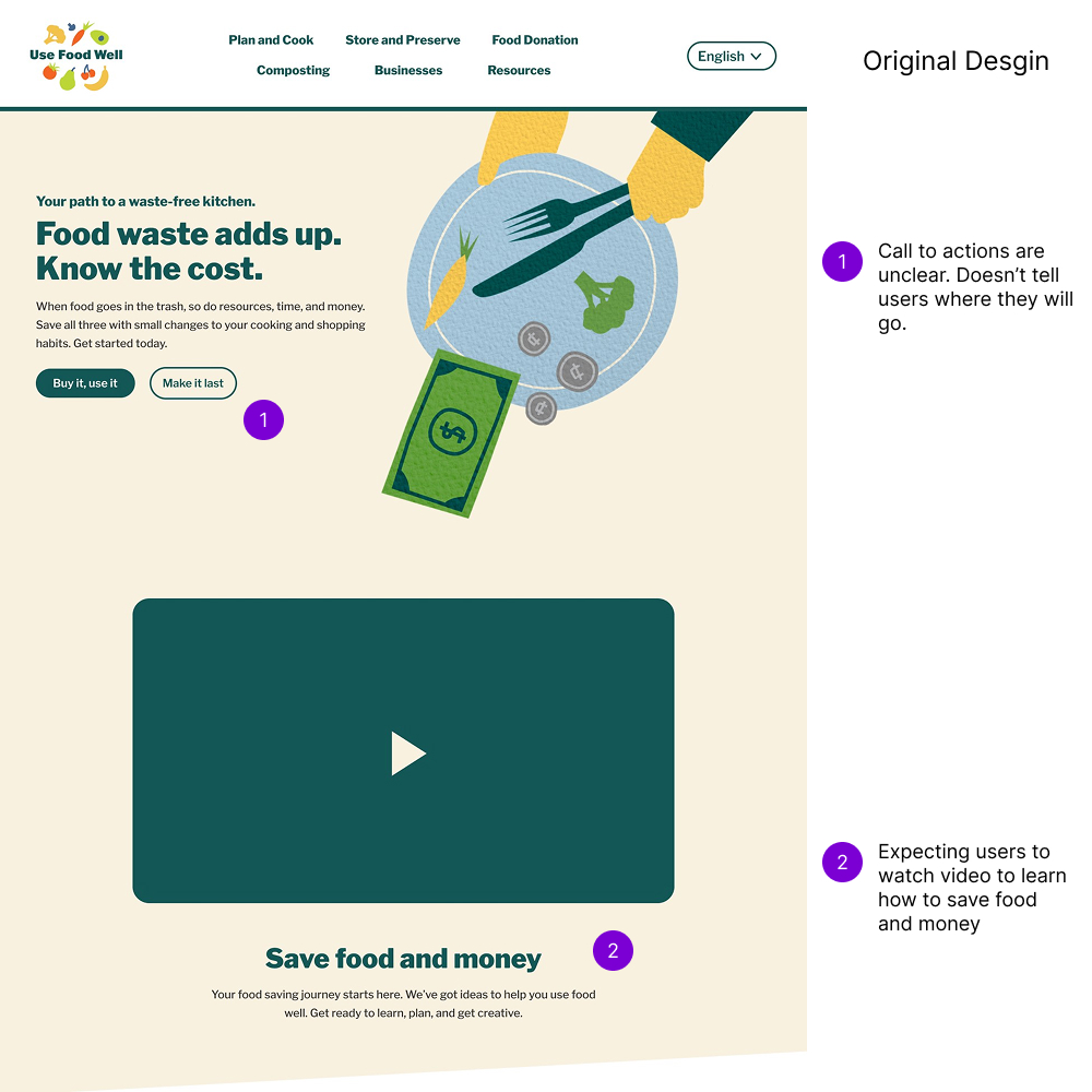
- CTAs like "Buy it, use it" and "Make it last" were vague and gave users no sense of where they were going
- Key information about saving food and money was locked inside a video, with no written context for users who didn't want to watch
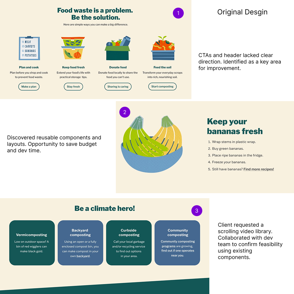
- A content carousel forced users to sit through auto-scrolling sections before they could continue down the page
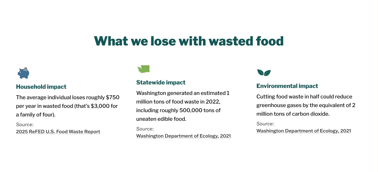
- There was no section that directly addressed what we actually lose when food goes to waste
Design
With constraints clear, I brought both the client and the third-party dev lead into the process early. Every direction ran through two filters: does the client want it, and can the dev team actually build it?
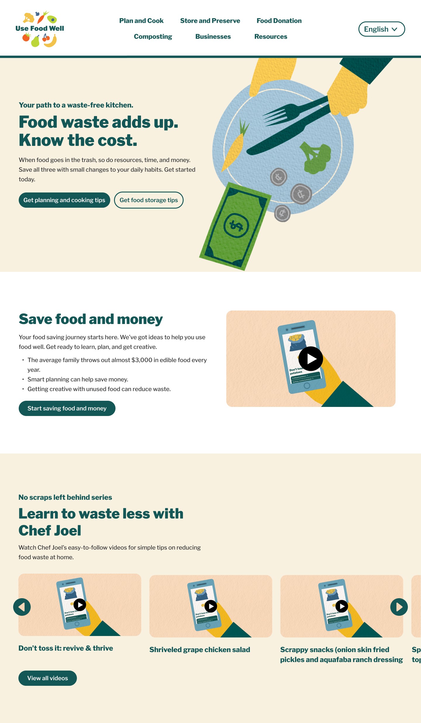
Getting creative with what already existed meant:
- A basic two-column layout became a video showcase section
- A heading and paragraph pairing, combined with an existing card layout, became a full video library
- The only net-new element was a horizontal scroll button, confirmed feasible with the dev team before a single pixel moved
- Every annotation pointed directly back to the problem it was solving
Delivery
The handoff was smooth by design. Thorough annotations meant the dev team rarely had questions about intent. Every button destination, heading size, and style was documented clearly before a single line of code was written.
The back and forth came from build quality, not design clarity. My supervisor and I ran ongoing QA/QC checks throughout development, flagging:
- Buggy interactions that didn't match the approved designs
- Incomplete sections that needed to be rebuilt or corrected
- Accessibility and usability issues caught before launch
The result was a site that launched true to the original design vision.

The Solution
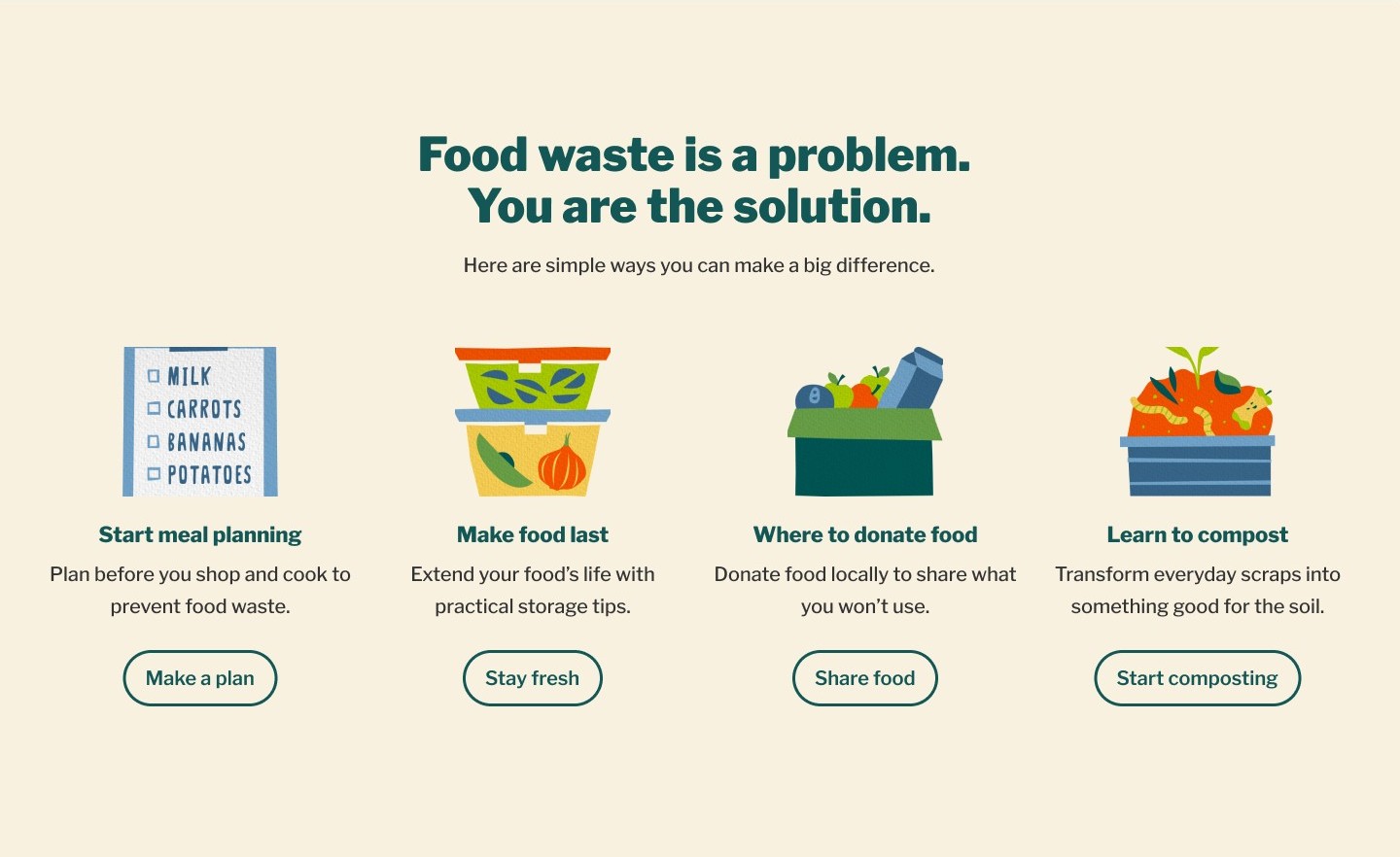
The redesigned site replaced vague calls-to-action with clear, specific direction so users always knew where they were going next. Key content that had been buried in video was surfaced into readable, scannable sections. The clunky auto-scrolling carousel was replaced with a user-controlled video library that let people browse at their own pace. And a dedicated section was added to directly address the real cost of food waste, giving users the emotional context to care before asking them to act.
All of it was built within budget, using components that already existed.
The Outcome
The redesigned site launched successfully, bringing structure and clarity to an experience that had previously lost users in seconds. The impact showed up in unexpected ways too. The client reused the design template for their holiday campaign, a sign that the system we built together was trusted enough to extend beyond the original scope.
The project also earned the highest recognition in the PR industry, winning two PRSA awards: Best of Show and the Silver Anvil.